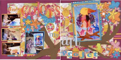
Last critique.... First, it's a good thing this is live, because it's so busy I can't get it to scan properly. Okay...... Alyca, thank you for touching up the photos. The pic of M and me isn't quite as blue as the scan, but it is a little on the blue side. I like that better than the yellow... I used UTEE on the word color as well as a few different colors of paint.... was able to turn the bird in as opposed to out, outlined the flowers and added a couple more..... added three stips of paper on the right (does it work better for you now Alyca?) .... added another mat to the bird photo as well as color words..... added some dimension to the 1 of 1st.... I think that might be it. Well? Is it crazy enough? I still LOVE it. I'm very excited to have it in Morgan's scrapbook, as I love that bird so much. :)

1 Comments:
Yeesh...it IS blue. Sorry....I must have gone a bit overboard....I like it a lot better now. I LOVE the outlining on the flowers, really gives them some dimension. I can see the 1 in 1st a lot better now, and the little stripes are teeny and small and give just enough help to make it balanced. Good job. AND...the word colors in this layout really SHOULD be colorful. I like it much more now. Good luck! I put my entry up on my digiscrapping blog (but I cheated and just redid an old layout. I think I will get points for creativity, since it looks NOTHING like the original kit, but it IS that same kit) The beauty of digiscrapping is that you can get something, ANYTHING, and very easily change the colors to match your photo, even exactly match it. So the blue and green papers and ribbons are now all pinkish and totally different. I have no thoughts about winning (I am out of scrapping mode and have lost my creativity, and there are some AWESOME digiscrappers out there), but I like it anyway
Post a Comment
<< Home